 It’s something we’ve been waiting for for a long time, and it seemed inevitable on the heels of Indiegogo’s $40 million Series B. Indiegogo will launch a redesigned web site and a new logo to all visitors very soon.
Logged-in users of the site will have the option to turn the new look on when logging in. Anecdotally, I think it’s a lot cleaner and more modern than the old design. Most importantly, the commenting feature seems to be working better than in the old design. Loading more comments is noticeably faster.
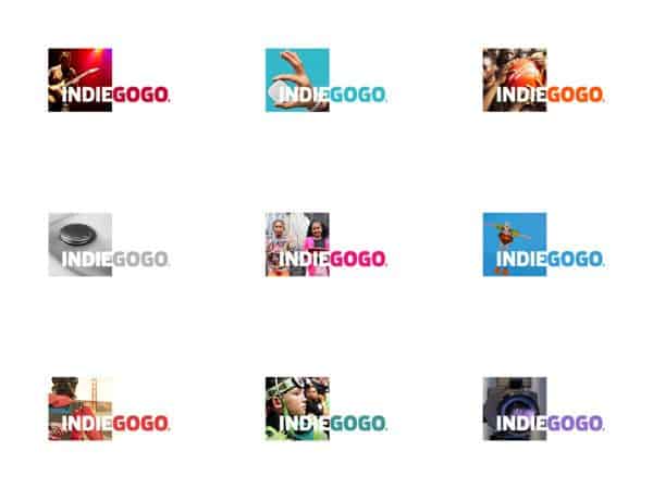
First, on the logo… the square behind the brand name will become an integral part of their brand as the logo will feature an image from an active campaign like the examples pictured below.
As part of the rebranding effort, Indiegogo has also released the following promo video…
“The world deserves a platform where anyone can fund anything from any device,” said Slava Rubin, CEO of Indiegogo. “Today’s milestone advances the user experience globally on Indiegogo and is a major step towards the further personalization and mobilization of our industry.”
“We wanted our new identity to reinforce our commitment to engaging with campaigners and funders alike,” said Shannon Swallow, Head of Marketing Communications. “Our goal is for every aspect of engagement with the Indiegogo brand experience to create a feeling of collaboration and empowerment.”
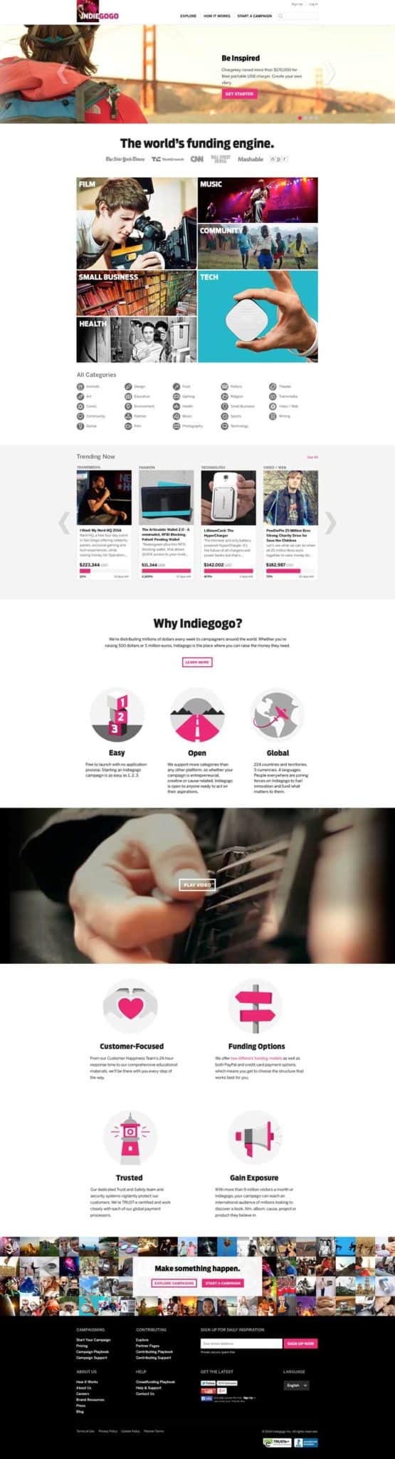
See a full screenshot of the new homepage below. For a larger view, click the image…