 As part of a “credit performance update”, Lending Club has published an 8-K with the SEC regarding a blog post that was published on February 7th that was “subsequently misinterpreted”. Lending Club has now attempted to better explain its message.
According to the 8-K from Lending Club;
The purpose of this blog post was to clarify what the chart means and provide the correct interpretation.
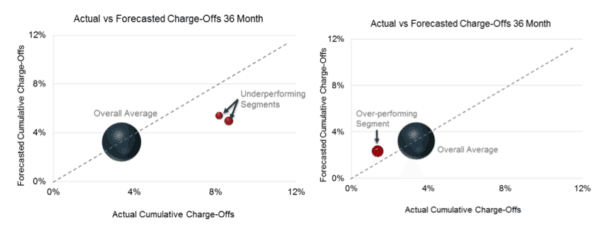
The chart [reproduced below] was designed to highlight the routine process by which we identify credit segments that perform either above or below expectations and inform next steps in terms of either adjusting credit policy or pricing. In this example, we highlighted two segments that were performing worse than expected and took the necessary steps to bring these segments back within expectations.1 The key clarifications with respect to this chart are:
- The larger dark blue sphere represents the overall, average performance of all standard 36-month loans, which includes the underperforming segments captured by the two red spheres;
- The position of the larger dark blue sphere on the chart shows that the average loan performance falls within expectations (just under 4% both forecasted and actual);
Lending Club then provides “additional transparency” for the over-all credit performance. Credit performance is said to be “coming in within expectations.
Lending Club will announce Q4 and full year 2015 results this coming Thursday. Interested parties may listen in on the call here.


