

LendInvest, the world’s largest peer-to-peer marketplace for real estate mortgages has released an interactive Buy-to-![]()
![]() Let Index for UK property. According to LendInvest, the LendInvest Buy-To-Let Index will be published monthly with a report featuring Buy-To-Let (BTL) performance indicators, rental demands, Buy-To-Let industry news and information on investing in BTL property throughout the UK. The LendInvest Buy-to-Let Index uses recent asking price sales data to provide a snapshot of the UK property market, and then overlays the current rental prices, to obtain an accurate yield for UK BTL property.
Let Index for UK property. According to LendInvest, the LendInvest Buy-To-Let Index will be published monthly with a report featuring Buy-To-Let (BTL) performance indicators, rental demands, Buy-To-Let industry news and information on investing in BTL property throughout the UK. The LendInvest Buy-to-Let Index uses recent asking price sales data to provide a snapshot of the UK property market, and then overlays the current rental prices, to obtain an accurate yield for UK BTL property.
 To produce the LendInvest Buy-To-Let Index, LendInvest’s Data Science team has done an analysis of the market, using nearly 1 million price points snapshotted for October, covering the whole of the UK. The data for the LendInvest Buy-To-Let Index uses data from Zoopla, one of the largest and most comprehensive property data providers and historical data from Land Registry, making the LendInvest Buy-to-Let Index the most extensive publicly available assessment of the UK BTL property market. The report is broken down below into separate diagrams detailing rental yield, capital gains, total return on investment (ROI) and the House Price Index at the Outcode level, disaggregated by number of bedrooms.
The below are graphs that the LendInvest Data Science team have created to allow investors to better understand the UK BTL property market (interactive graphs may be found here).
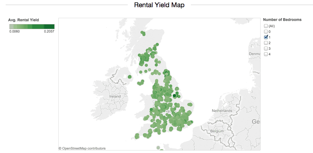
The Buy-to-Let Index uses “asking price” data powered by Zoopla snapshotted on 16/10/2014. Approximately 700,000 sales and 250,000 rental listings are used in the Index. The average asking rental price per year is divided by the average asking property purchase price. The data is aggregated at the UK Outcode level and rental yields are worked out separately for studio, 1, 2, 3 and 4 beds properties for greater accuracy. The average rental yield for a 1 bed property across the UK is 5.9% compared to 5.2% for a 2 bed and 4.6% for a 3 bed.
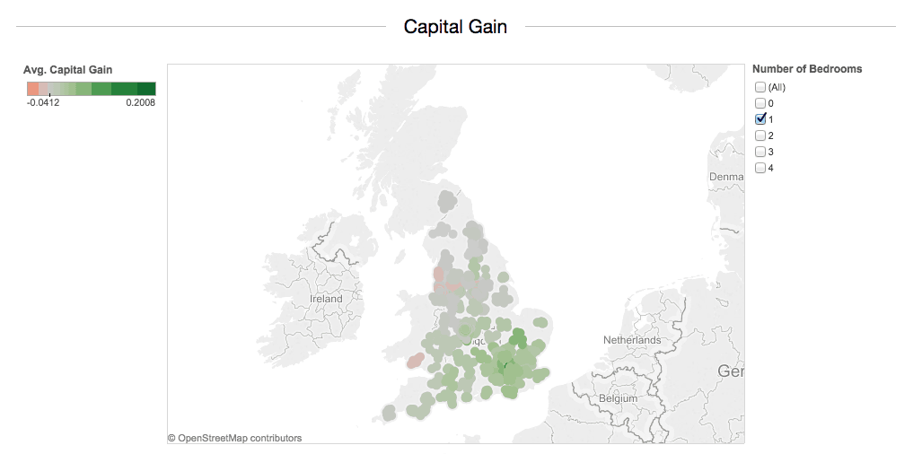
The capital gains are worked out using the Price Paid data from Land Registry for the years 2009 and 2013. The average house price, per Outcode, in 2013 is compared to 2009 and the increase is averaged over the 4 years. Capital gains on average are 2.5% per year across the UK, for this period, and have historically been the highest for Outcodes WC and W8. House prices for these Outcodes have increased on average around 20%, year on year.
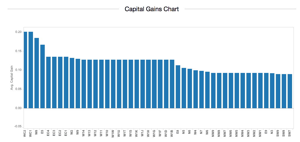
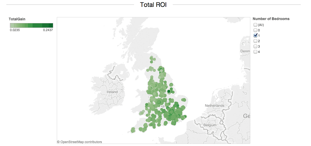
The Total Gains are a simple addition of the rental yield plus the annual capital gain year on year. EC3, WC1 and WC2 have the highest returns on investment yielding up to 25% year on year. Total return on investment shows the higher rate of capital gains in London compared to rental yields.
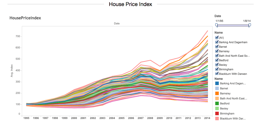
The House Price Index uses Land Registry’s methodology which can be found here. The HPI uses 19 million sales records since 1995 whether purchased with cash or with a mortgage and uses the Repeat Sales Regression method. This ensures a like-for-like comparison between properties, and at the area level will provide a more robust indicator of house price increases. The highest house price increases have been seen by Hackney over the period 1995-2014 experiencing a 7.5 fold increase. Hackney is closely followed by Kensington and Chelsea (7 fold increase) and Lambeth (6.7 fold increase). The Hartlepool, Middlesbrough and Kingston Upon Hull areas have had the lowest increases experiencing as little as 20% growth over the period.