

A little less than a year after receiving $802,812 on Kickstarter for their New York City Transit Authority Standards Manual project, artists Jesse Reed and Hamish Smyth have returned to the crowdfunding platform to raise $158,000 for the Reissue of the 1975 NASA Graphics Standards Manual.
While revealing details about the project, Reed and Smyth wrote:
“[In 1972] Neil Armstrong has uttered his famous words. The Apollo era has come to an end. Public interest in space exploration wanes. After all, how do you top a man on the moon? Designers Richard Danne and Bruce Blackburn—of the New York firm Danne & Blackburn—walk into a room at NASA with a portfolio. Inside is a presentation that will change the face of NASA and their careers with it.
The presentation is a hit. The work is approved. But what Danne and Blackburn don’t know is that over the next 18 years, some people at NASA will attempt to revoke their work. And they will succeed in 1992. This Kickstarter campaign is a celebration of Danne and Blackburn’s work—brought back to earth 41 years after it was designed, and 23 years after it was lost.”
Sharing a more of a backstory about the manual, the duo unveiled its timeline:
 1972: “With President Richard Nixon’s push, the National Endowment for the Arts (NEA) initiates the “Federal Graphics Improvement Program,” to raise the standard of design and communications of US government agencies. At the time, the NASA’s graphics and communications were fragmented, old fashioned and had no clear, unified voice. NEA chairman Nancy Hanks identifies NASA as a prime candidate for a big win for the program.”
- 1974: “The small and young design firm Danne & Blackburn—led by Richard Danne and Bruce Blackburn––receives a request for proposal (RFP) from NASA. Of the dozen or so RFPs, they are awarded the project, and set about designing their vision for the agency. Danne and Blackburn present their work to then NASA administrator Dr. James C. Fletcher, and his deputy, Dr. George Low [later that year].”
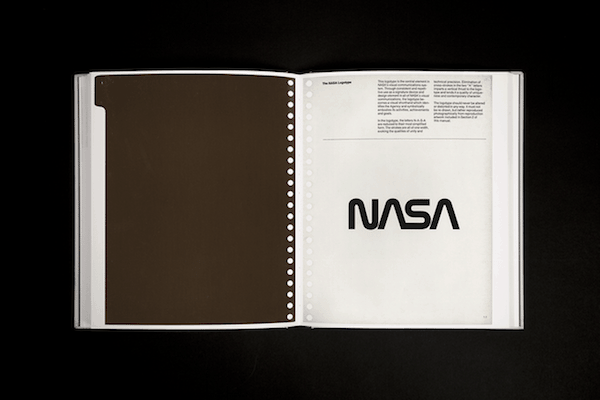
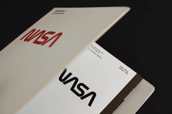
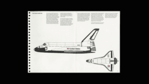
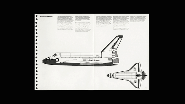
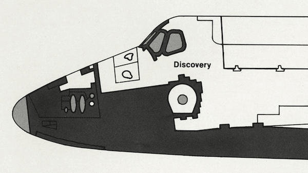
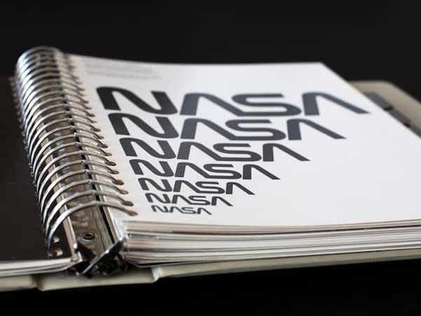
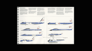 1975 – 85: “After the initial phase of work, the NASA Graphics Standards Manual is released as a 8.5 x 11” ring binder. Over the next 10 years the manual will be added to, culminating in an extensive document that includes instructions on designing every aspect of NASA’s new identity—from letterheads to space shuttles. The new identity, which is spearheaded by a logotype that becomes known as the ‘Worm,’ works to unite NASA’s many departments through a single and cohesive visual language. “

- 1992: “After almost two decades, and many challenges along the way, the Worm is rescinded by NASA. The previous logo, known as the ‘Meatball’ is reinstated.”
- 2015: “Months after the completion our campaign to reissue the NYCTA Graphics Standards Manual, we contact Danne to ask about getting a copy of the NASA manual to potentially reissue it. He says yes.”
The duo also noted:
Specifications of the reissue are the following:
 Approximately 5lbs (2.3kg) on earth, 0.9lbs (2.3kg) on the moon
- 200 pages including 10 gate folds
- 93 plates printed from high-resolution scans of Danne’s personal copy of the manual
- Images from the original presentation to NASA by Danne & Blackburn
- 9.5 × 11.5″ (241 × 292mm)
- CYMK + 5 Pantone® spot colors
- Hardcover with soft touch lamination and two-color silkscreen
- Printed in Italy
- 100 gsm Yupo Original and Perigord Matte 135 gsm
- Stochastic printing
- Red head and tail bands
- Individually packaged in static shielding pouch
In regards why they believe the NASA manual is worth reissuing, Reed and Smyth added:
“We think this manual and others like it—regardless of the organization—are a beautiful example of rational, systematic design. The NASA manual is one of those examples that sets the standard for design excellence—a document well worth preserving for the future as a learning tool, a gorgeous object, and a moment in design history.”
Since its launch on Monday, the project has surpassed its initial goal and is over $320,000. Backers will receive the book March 2016. The campaign is set to close on October 5th.
____________________________________________________
Have a crowdfunding offering you'd like to share? Submit an offering for consideration using our Submit a Tip form and we may share it on our site!